Knowing the rules of using color in office design will help you quickly choose and develop ideas for scientific workspace, promoting productivity for employees.
The color in the office can become a useful tool to help connect brands and employees. As well as create an ideal working environment. However, for the color of office space to make these values, it needs to comply with some proven scientific principles. Below, AfA Design has combined collection and expertise to help you find three principles that help design workspace become scientific, harmonious, and beautiful.

Understanding the color in office design
Once we enter the era of recognizing the importance of workspace design, color is also a factor considered by psychologists and businesses. This is a critical visual perception element, describing different frequencies of light through categories such as red, yellow, or green. We distinguish these colors due to a unique combination of shades, shades, tones, and shades. It's one of the many ways we understand the world around us, and we often don't realize how it affects the many choices, thoughts, and interactions we have at any given moment. We think of colors when we wear work clothes or rely on colored traffic lights for directions.
Our color choices in office design are made through personal preference and our knowledge of the benefits some colors can bring. We know that specific colors can positively contribute to emotional, productivity, and even physical health in the workplace. However, we cannot rely on just one coat to achieve these goals - a combination of color, lighting, and other environmental characteristics can create the best support space for employees. It requires the right balance between customizing the space with unique corporate attributes and making sure it's comfortable and enjoyable for people to be productive. And this balance should pay attention to the following analyzed color selection principles.

The top three rules for choosing colors in workspace design
It is not necessary to guarantee all three principles. You can entirely rely on one of these principles to request the office design company or choose furniture, decoration.
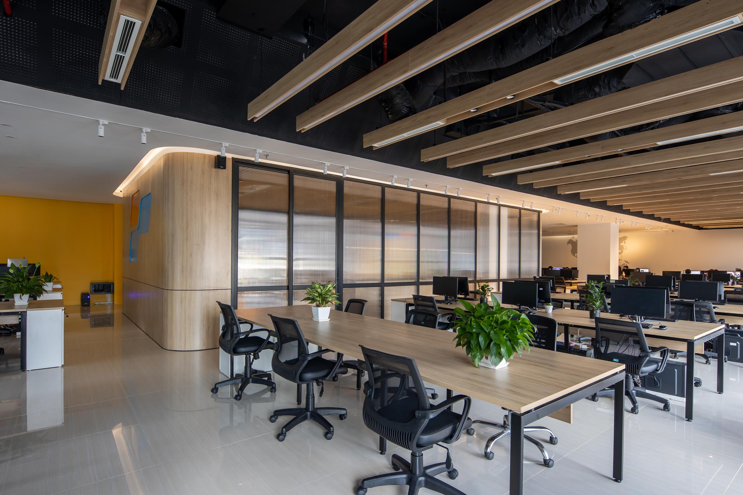
The color must provide a sense of cohesion.
People with different relationships, experiences, abilities, and connections affect the way we perceive visual stimuli. Not only do we perceive colors differently, but we also use colors in different ways across cultures.
For example, in a multinational company, many people from cultures use richer colors more freely in everyday applications. However, there is one thing in common here whether your company is a multinational or a multi-layered decentralized company. That is how humans react to uniform shades of color. Therefore, office space's color requires bringing cohesion to help your employees feel a connection between themselves and the workspace, creating harmony with the working environment, promoting positive emotions and familiarity.
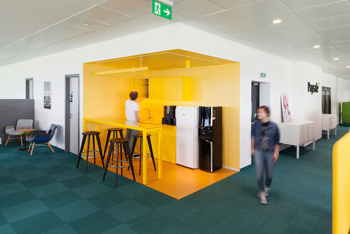
The color reflects the brand's mission.
Color also has a powerful ability to connect people with your brand or company vision through ideas or feelings. Many companies and organizations are spending billions of dollars to ensure that this is achieved with the target public but often forget to use color as a brand awareness tool for employees. A branded environment is a physical space that visually reflects the nature of the organization or company through features such as an experiential graphic design. Brand reflection can be an excellent opportunity to find something unique and compelling about the work you do, and there are many ways to incorporate this through color.
The most effective way is to use brand colors as the primary color in office decoration design. But this cautious approach may be too simple and not deliver much emotional experience for employees. Many leading companies are developing beautiful identity palettes and understand that it is not just one color but also colors that create a unique working environment. Every company should have brand guidelines that cover primary and secondary colors, find unique combinations that further differentiate the brand, and elicit emotional associations from employees. If you can relate the identity color palette to the workspace, it increases brand awareness with employees and turns the company's workspace into a unique, hidden space.
Choosing color shades that are compatible with the working environment
There are many theories about the effect of colors on human emotions. For example, yellow can evoke feelings of optimism, warmth, and creativity. However, it is essential to consider that there are thousands of yellow shades, which can have different effects on human psychology. The tint of color not only changes how the color affects the environment and the experience, other factors such as gloss, texture, and opacity also affect the way color is perceived and the overall environment.
Other factors change color perception as well - it can interact with light to create different observations of space, e.g., yellow-toned light can create a perception of color. The color is entirely different from the cooler-tone light. This is one reason that color choice cannot be separated from the design of the morning or the material background of color.
Color is deeply rooted in the life and affects a lot of human experience of the world. In the past, the color was a lifestyle choice; now, it is used to connect employees with their brand. Color can also improve the employee's experience at work, influencing their concentration, stress level, and mood. If wat to achieve these goals, it is vital to understand how different colors interact and other factors such as light and materials. For these reasons, we should be sensitive to all aspects of color, using it to affect the workplace positively.
If you need advice about a modern office design solution with scientific and harmonious colors. Please contact AfA Design immediately, according to Hotline 0915 075 858. Or inbox AFA Design fan page for detailed support and advice.